Problem
Runners in Russia were losing easy access to Strava, Nike Run Club and similar apps. Blazee set out to be an accessible local alternative: tracking, training plans, progress and a community in one place
The first question was whether runners needed a new app at all, and if so, which jobs it had to do better than what they already used
Research
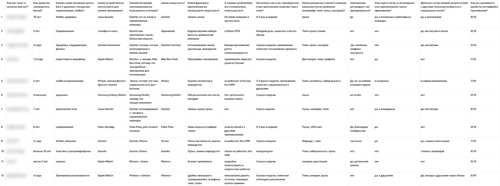
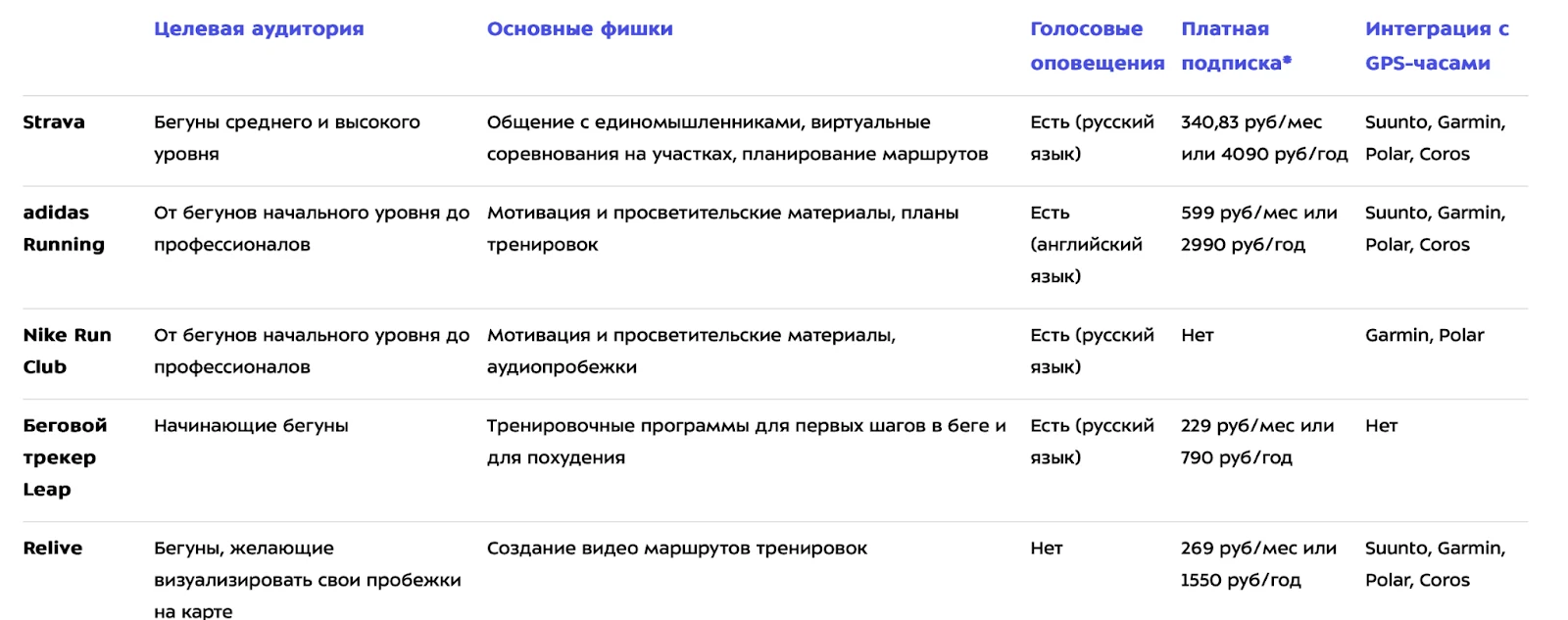
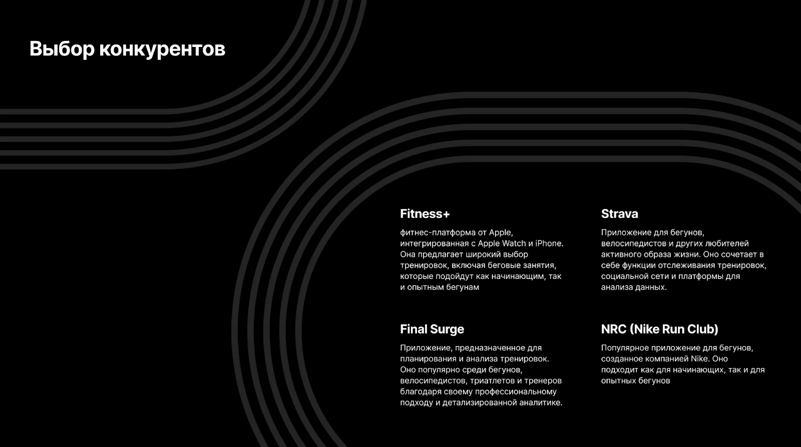
I ran customer interviews (CustDev) to understand runners’ problems, the tasks they were trying to solve and what was missing from their current apps. The apps respondents used most were Strava, Nike Run Club, Fitness+ and Final Surge. Sport-Marafon, a retailer for runners and triathletes, also shared their comparison of apps their customers use
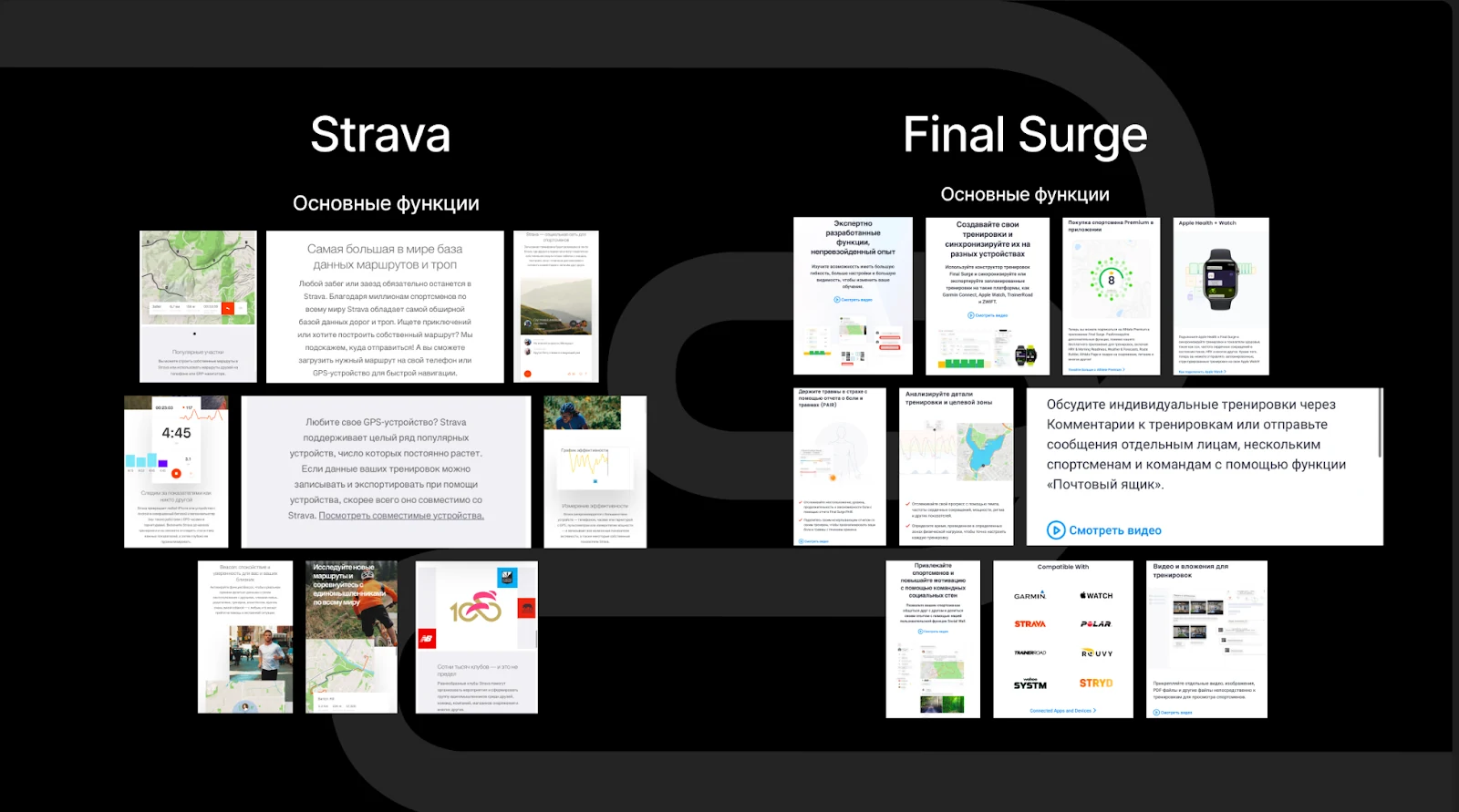
I compared the products on purpose and audience, running features, availability and integrations, and strengths and weaknesses, using my own testing, App Store and Google Play reviews, Reddit and Twitter threads, and the interviews. That defined the core user groups and the hypotheses for the product
Scenarios and flows
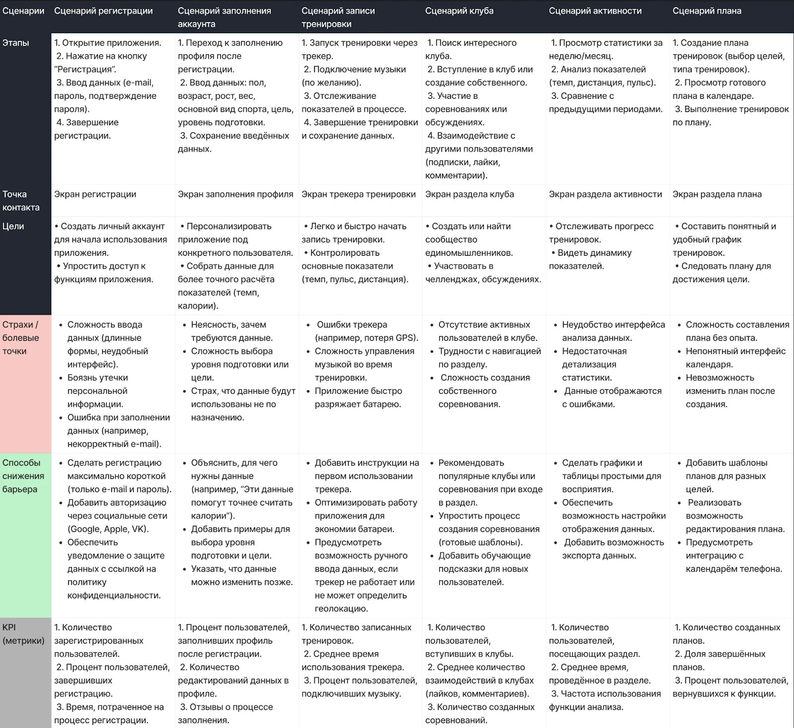
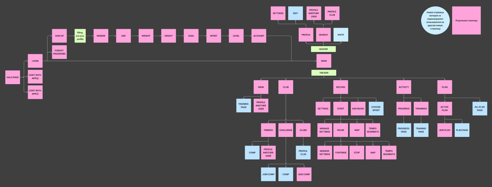
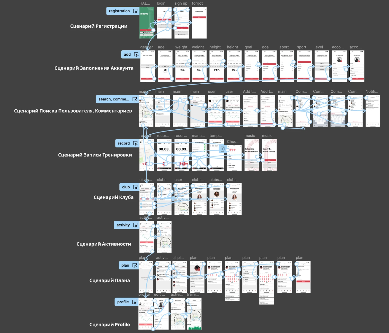
From the validated hypotheses I mapped the key scenarios in a customer journey map, then built the screen map for the app
Visual direction
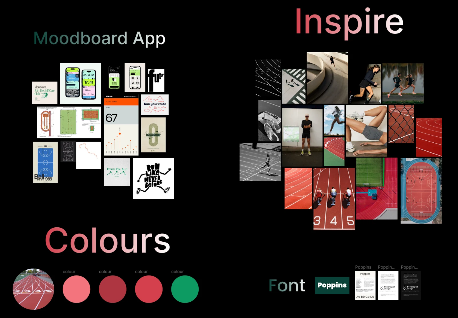
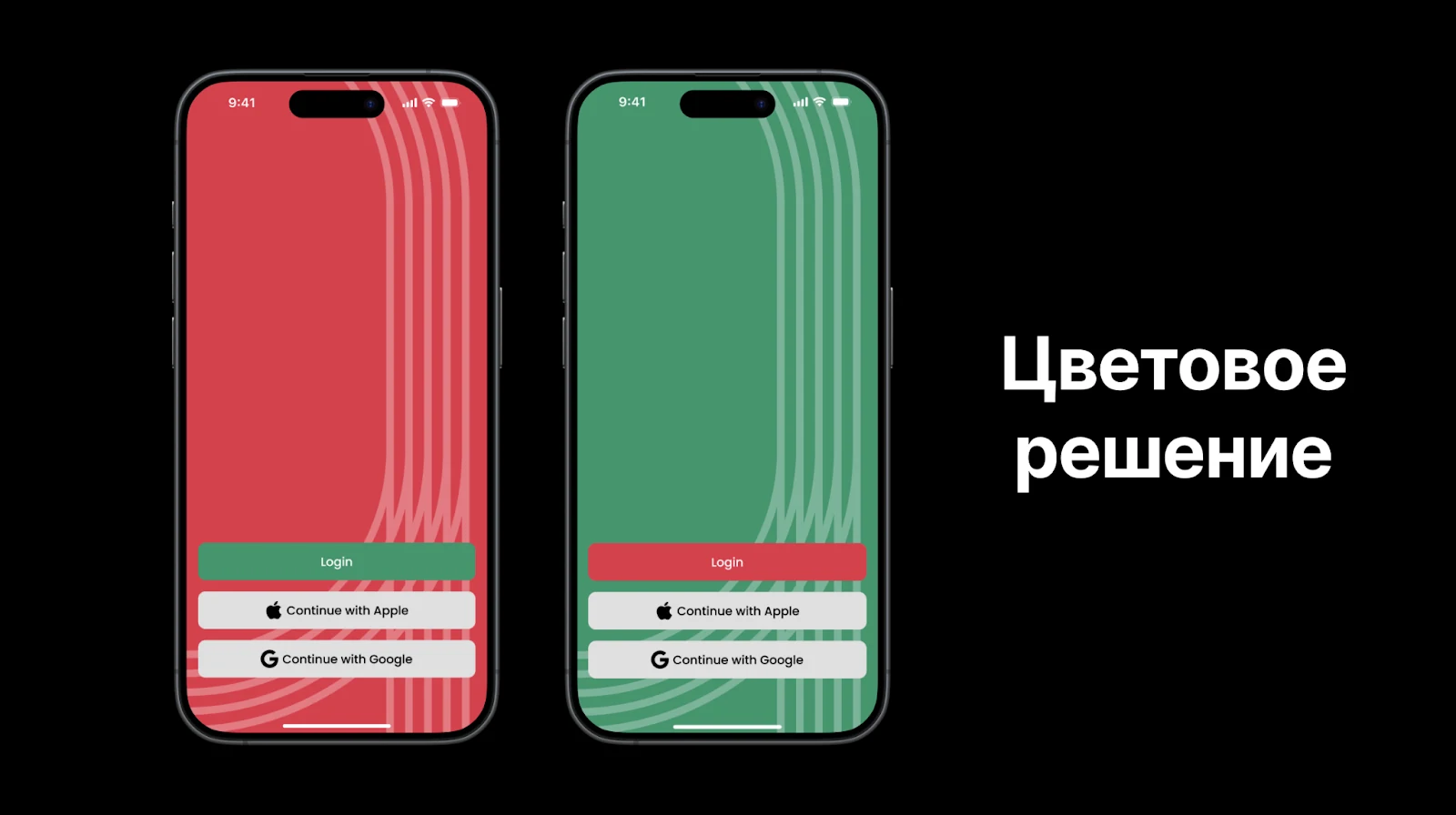
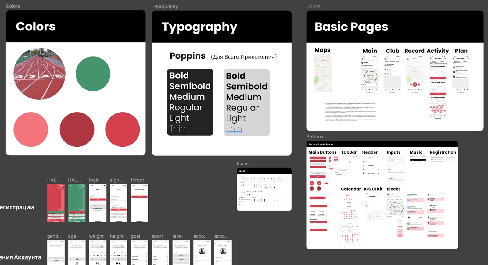
I looked at apps with monochrome interfaces and one or two accents, and at running tracks and route graphics. The track itself suggested the palette, so I explored two accents: green, and the red-brown of a track surface
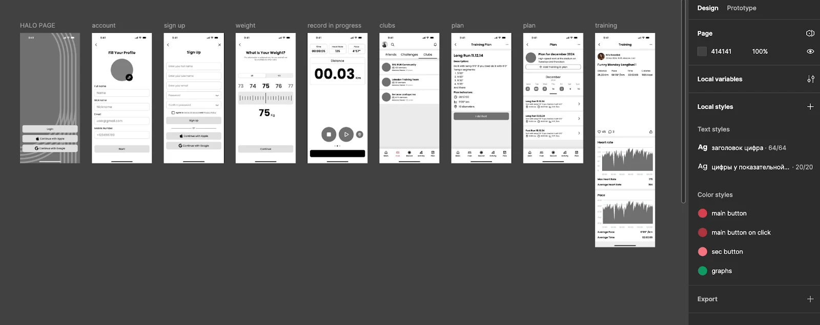
I designed detailed wireframes while building the UI kit in parallel: colour styles, type settings and core components
Usability testing
Before handoff I tested interactive prototypes in moderated sessions with seven potential users, watching how they handled the core scenarios
Visuals and the social features worked. Navigation and dense statistics were the weak spots. Testing pointed to three improvements, and I made all three: detailed stats became easier to scan, runners can now choose which data they see during a run, and reminder frequency was tuned to motivate without nagging